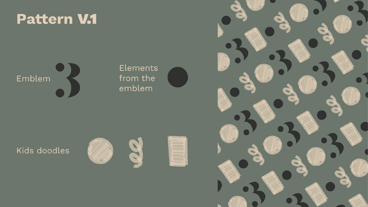
Designing a clothing brand for children was a nice challenge because the visuals had to be attractive to the parents, because they are the buyers, but also for the children because, well, they are the wearers. Combining sharp and bold shapes with kid's doodles gave a nice balance to the imagery overall. The client wanted something warm, classy, cute and it was very important to her to have a typography type of logo. Her idea was to give people a little hope, and a little peace and that's why the number three was chosen to represent the brand from what the number represents in so many cultures.